Saturday 20 November 2010

Stage Designs


I have been looking at amalgamating my set designs for Greek Tragedy with the War genre. In particular I have been looking at the use of gauze and lighting. I have put the set pieces onto strips of gauze that can be light to reveal or hide what is behind it. They will be painted with trees and Greek columns that will represent a forest. During a group tutorial with Andy we looked at using more gauze to hide the temple at the back of the stage and then with lighting slowly reveal it as the characters move through the “forest”. I am going to experiment with the gauze being double painted so that it can show two different images depending on the lighting.


Monday 15 November 2010

Stage Designs of Richard Finkelstein

 
I like the use of projections to create different scenes and atmospheres with such a simple affect. All four images are really striking and visually powerful, but also completely different despite being the same stage.

Clytemnestra
 (scenery design / Projection design)
Context/Pretext:
This production marked the North American premiere of the Tadashi Suzuki version of the work. The production was directed by Suzuki’s former student, Yukihiro Goto and was presented by The State University of New York at Stony Brook in a black-box theatre pre-configured as an end-room proscenium environment (SUSB has multiple black-box theatres so this one is semi-permanently configured). There was a small to modest budget for scenery of around $1500.
Description of the Setting and Projection Elements:
The setting consisted of a series of screens that could travel across the stage on cable. The screens could close off portions of the stage, or move in choreographic patterns with the actors, or situate into a traditional wing and drop style configuration.
The screens were of an innovative design. They were fabricated from plastic "safety snow fence" the orange net fencing material one most often sees around construction sites. These were transformed into high-gain projection surfaces through the application of a silver coating. Since approximately 60% of the area of the screen material consisted of holes, the screens took on a scrim function as well. When layered and interacting with actors, light, and projections, a myriad of moiré patterns were created.
Behind the planes of screen operation were situated 2, 8 foot high seats on which sat the "gods" through the entirety of the production.
At the rear of the stage, to create maximum depth and light dimensionality, we fabricated a rear projection cyc. Our budget was so very limited that I had to experiment with found materials. In the end I designed the RP cyc from black plastic garbage bags, slit, and re-assembled into a drop. It took a lot of experimentation with different brands to find the best product for this application. There was some wrinkling, but with the angle of projection being very flat, the wrinkles, as seen through the screens, took on a very shimmery quality.
Another innovative element was a series of bodies produced as props. These were produced in a stylized sculptural manner from raw 1" diameter Ethafoam.
Working Within the Suzuki Style and Sensibilities:
Support of the Suzuki style and methods became a paramount objective in this assignment. My understanding of this system came primarily through work with the director, Yukihiro Goto, and through extensive observation of the actors in training and in performance. My observations of the style and process were as follows:
  • The training and style is intensely physical
  • The style is about the performer within and interacting with, and creating SPACE
  • Within the movement style, stillness is celebrated as an important choice of movement.
  • The movement is oven very disciplined and stylized.
  • The style is very presentational (vs representational)
  • The actor is the focus, but within space.
  • The style presents classical theatre forms, but interpreted through modern structure. In this sense it is a very post-modern theatre form.
  • There are also elements of cultural fusion. In this case we were integrating three cultural sensibilities geographical and temporal, The classical Greek, Classical and modern Japanese, and modern western forms.
In the scenery and projection elements, I aimed to support the style, but I was excited to offer physical parallels to the style as well. The results were exciting especially as in the end, the acting/directing style also greatly supported the visual work. For instance the wonderful use of stillness allowed for the lighting by Richard Dunham as well as my projection work to be even more striking than would normally be the case. The disciplined blocking allowed for maximum control of light and spill.
In the design, as Suzuki does, I use a traditional framework, in this case the wing, and drop form, but re-interpret it through the use of modern materials and new perspectives. The set feels at once, Japanese, classical, modern, and Western.
The kinetic nature of the set allowed for a complete integration with the actors and their movement. The clear floor allowed the actors full control of their space. The projection elements allowed for strong support of the emotional texture of the work. They were all abstract images and textures from my collection of projection images.
A word on the Projection Technology
The photographs of Clytemnestra presented in this portfolio are not re-touched (except to remove photo blemishes like dust and scratches). Even at curtain call, the projections were quite bright and striking. Yet this was accomplished with a single, off the shelf, Kodak Ektagraphic III projector (before bright module technology) at the rear of the audience area.. Through an understanding and application of basic principles of optics, I have been able to develop techniques and methods allowing projections to be 2-8 times brighter than they would appear in most theatre instances. This show provides an example of my work in this arena. Even with the extreme wide angle of a 1.4" fl lens, the images are striking. One review even referred to the beautiful "painted drops" in the set when in reality all images were from the projection work.

Saturday 13 November 2010

These are some designs to go with the costume drama proposal.
Possible set design
Costume designs
Costume designs

Friday 12 November 2010

Genre Development

Little Red Cap:

I am looking into developing idea for adapting “little Red Cap”, the passage I have chosen to focus on is the scene in the forest where the wolf encourages and lures Red Cap off the path and into the forest, so he can go ahead and attack her grandmother. I really liked the dynamic of this scene as it flows like a cat and mouse chase, the wolf sly and cunning manages to convince the naive little girl that the woods are so beautiful and alluring, she should go and explore them. I have been trying to find different ways of showing tree, both realistic and more abstract.

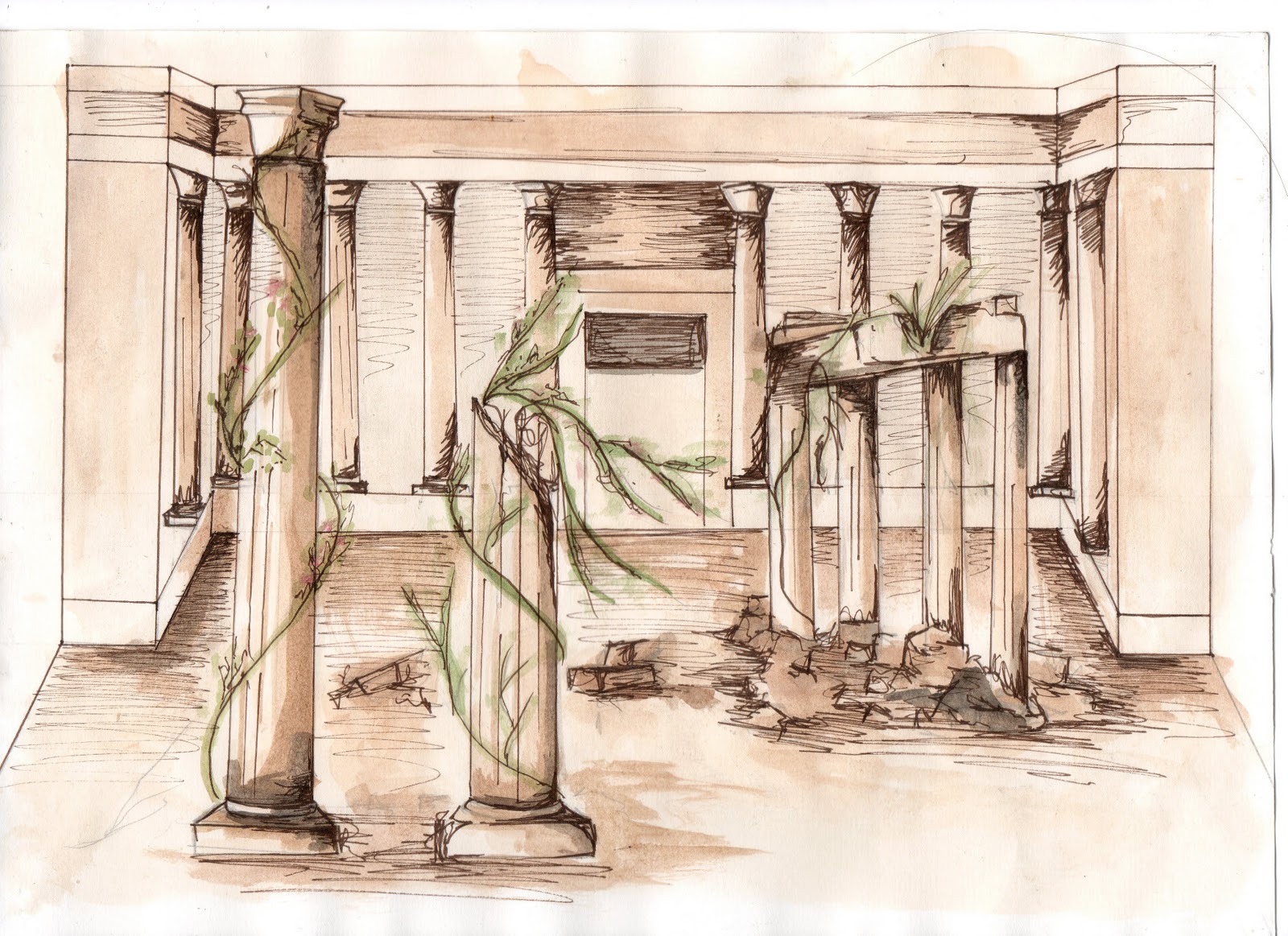
One genre I have explored is Ancient Greek Tragedy, drama based on human suffering and concluded with the principle characters being killed at the end. For the set I have looked into ancient Greek amphitheatres, staging and structure. The sets consisted of a Paraskenia, a long stone wall at the back of the stage with projecting sides used for entrances and exits. In front of the paraskenia was the proskenion which was made up of columns and similar to a modern day proscenium.           
Within my initial set design I have kept the paraskenia to give the impression that the action would be taking place on a real Greek stage. The rest of the set I have shown as ruins of old temple columns and buildings or even the crumbling theatre itself to represent trees overgrown with foliage and vegetation. As fluted columns are thought to be designed on the structure of trees I thought they would be ideal to build up a stone forest that the actors could move among getting lost and tempted away from the right path.
stage mood board
set sketches
possible set design
The costume designs I have kept simple with the character wearing traditional Greek robes made of white cloth. For Red Cap I have given her a red accent hooded cape. I have also looked into the use of masks which are considered an iconic convention of classical Greek theatre. I especially liked the use of a mask to represent the wolf as it is quite a challenging character to portray.


costume mood board
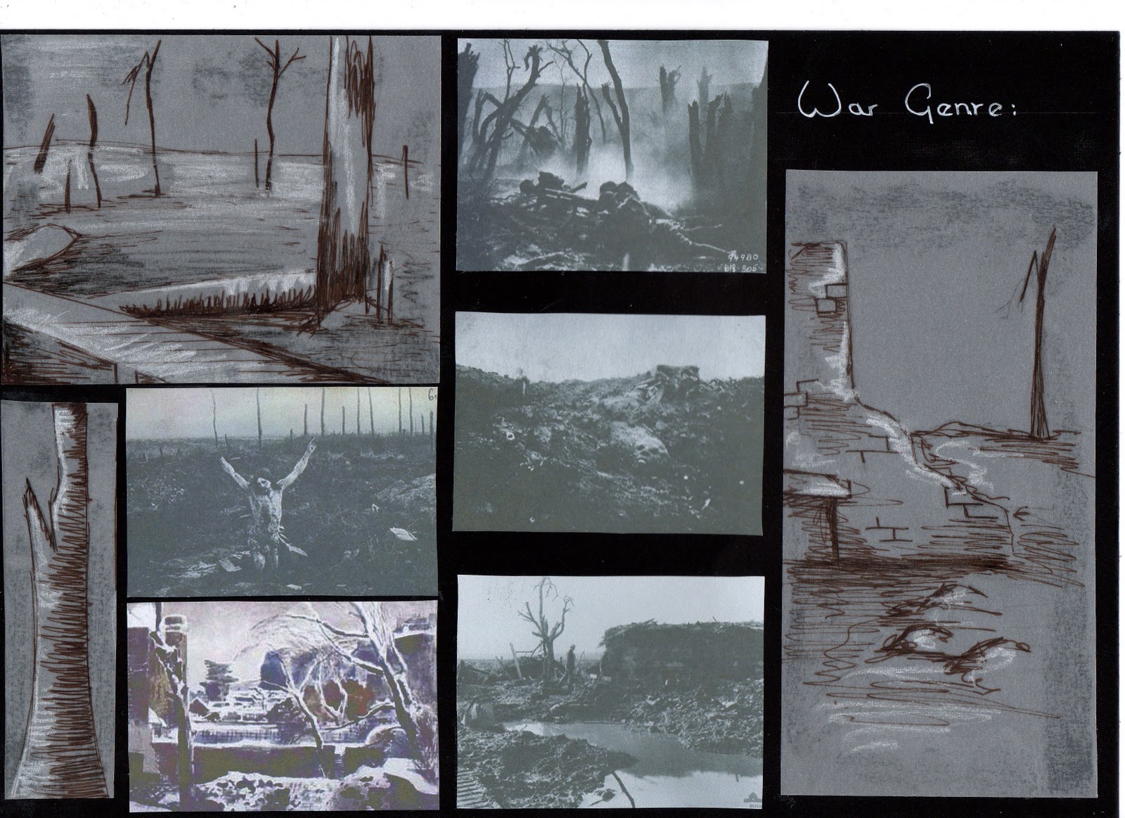
The second genre I have looked at is the War genre, mainly the two world wars. For the staging I have looked at a shattered landscape made up of trenches, bombed buildings and destroyed trees. I have been struggling with how to represent this on the stage without going overboard with too much set and props. I really like the war horse set which had no physical set but represented everything through lights, sound and projections. One idea I have explored is having a set made of strips of painted gauze that lighting could be shone through to create different moods and times of day. The gauze would be painted with a war landscape of trees and debris and again be like a maze of paths that the actors could move between.
set mood board
possible set design
The Costume I have designed for Red Cap is a 1930/40’s woollen coat in red worn as an outfit a young girl would have worn with white socks and school shoes. For the wolf I have tried to move away from the idea of him being an actual animal, but rather a person who embodies his character. I have designed a costume that shows the wolf as someone from the military opposition, a person who could divert Red Cap across a battle field or into danger. However, I am concerned that if he becomes too much like a Nazi it could be a little cliché and unimaginative.
For both the costumes and the set I have chosen a restricted could pallet of monotone black white and grey, with Red as the main accent colour. I would like to use colour in a similar way to Spielberg’s “Schindler’s List” as I have always been captivated the imagery in this film.
costume mood board

The third genre I have researched is costume drama. For the forest set I have played with the idea of making it a ball room scene as these are synonymous with costume dramas. I would like to use a concept that has been developed in Brighton Pavilion where the columns holding up the kitchen roof have been made to look like trees; also the light fittings and decor in the dining room have been made to look like plant and foliage. The forest setting along with the people at the ball would give an idea of being surrounded with different routes that are difficult to pass through.
set mood board
The costumes are both typical regency clothing typical to like style of production. Red Cap has an elegant empire line gown with red accents, whereas the wolf I have designed as a rogue gentleman similar to the character of Mr Wickham in Pride and Prejudice, whose only aim is to steal the virtues of young ladies.   


costume mood board


Any thoughts on which genre I should take forward would be appreciated.


Friday 5 November 2010

"The French Revolution is easier to swallow than Nepoleon"


 The Cook, The Thief, His Wife, and Her Lover


This lavishly offensive film is such a hard pill to swallow. The genre clash of Romance, crime and Horror made it an intense 2 hours and 4 minutes. The costumes designed by Jean Paul Gaultier really played with the setting of this film where Albert Spica (Michael Gambon) is dressed in late 19th Century clothing reminiscing of George VI, Georgina Spica (Helen Mirren) along with her lover  appear to have been lifted from the 1940’s . For me this added confusion to an already twisted plot line, not being able to second guess a story always adds a certain amount of trill. I found the colour changes fascinating, waiting for the scene to change, and looking out for what was different. The colour choice also did nothing but enhance the overall mood of the film, cleverly chosen to work with the action that was taking place in the different areas. The red dining room reflected not only the fear and anxiety of Georgina and the other guest, but the fear I felt in the audience, unsure what was going to unfold next. Green not a colour normally found around food, but here somehow seemed to work, creating a calm place where Georgina could breathe and relax, just be herself with the man she loved. Similarly Albert never had dominance in the kitchen, he could come in and destroy it, but the Cook Richard always had the final word over him. The kitchen was the quiet slice of sanity between Albert’s two haunting grounds. The sinister blue car park was where most of his really degrading work took place. The blue/black of this area made it really difficult to see what exactly was happening, unable to make out what you are witnessing and left to piece together what you perceive is taking place.
I liked how the set seemed more like a theatre set in one consecutive line with the continuous camera shots moving from one area to another. It created a real surreal atmosphere as the actors were able to move seamlessly from area to area, colour to colour without any unattractive edits or cuts. Although totally over the top this film also seemed totally believable, drawing you in from the very beginning to leave you stunned at the final climax.